
This week my program featured a selection of some of my favourite album artwork. This included single artwork and album artwork. There was also a co-host this week, Adam from Fear of Music (on Tuesdays from 1-2:30 PM). I was also featured as a co-host on his radio program where he also did a show on artwork. You can check out his list on his Fear of Music blog. Below is a description of the choices made as well as some that did not make it onto my show this week due to time restraints.
Album Artwork Selections:
The Dead 60s - The Dead 60s (2005)
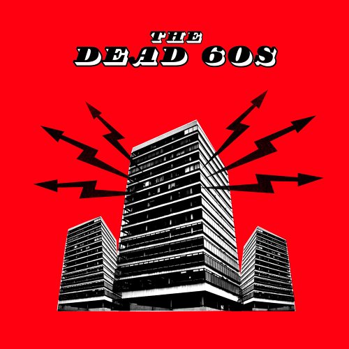
This album was released in the UK in 2005 and several months later in the US. The track listing differs from the UK and US versions and so did the artwork. The actual artwork is a pop art styled version of an actual building in Liverpool, where the band comes from. The Concord House is the office building on the cover and it is located near the Liverpool Lime Street railway station. The UK version of the album features a red background while the US version has a yellow one.
XTC - Go 2 (1978)

Designed by a group of British album artwork designers known as Hipgnosis, Go 2 features a different kind of artwork. In fact there is an essay on the front of the albums cover instead of any picture or artwork. Originally released in 1978, this album featured a different track listing in the UK than in the US. The albums title (Go 2) was named in part due to a Japanese strategy game called Go. The two was put after the word go because it was the bands second album.
U2 - 11 O’clock Tick Tock (Single 1980)
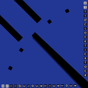 11 O’clock Tick Tock was U2's third single. It was released just before the release of their first full length album Boy. Produced Martin Hannett (known for his work with Joy Division), this single featured the bands early post punk influenced sound. The actual artwork features a close up picture of a clock (pointing to 11) with a blue/purple coloured background. Along the side of the single cover the words "U2 11 O’clock Tick Tock" are featured in blocks. Three versions of the song exist, all of which are different takes of the song. There is the original single mix, a slightly longer mix for a Martin Hannett tribute album and a version of the Pride single.
Devo - Be Stiff EP (1977)

The Cure - Boys Don't Cry (1980)

This album was actually a US version of the bands first album Three Imaginary Boys. It also features a different track listing than the original UK album. The albums cover features palm trees, a sun and burned/frayed looking bottom. The cover always reminds me of Egypt, maybe it's because of the song "Fire in Cairo", but either way it is an interesting album cover. This album is also an early representation of the band, who would later be known as Gothic. At this point in the bands career they were making Punk/New Wave sounding tracks.
Franz Ferdinand - You Could Have It So Much Better (2005)

The album artwork for Franz Ferdinand's second album is similar to artwork by Russian avant-garde photographer Alexander Rodchenko. It was inspired by his portrait of Lilya Birk. The album itself reflected a more punk inspired Franz Ferdinand than their first album.
The Diodes - Action-Reaction (1980)

The third album by Canadian punk band The Diodes showed off a more Power Pop and Hard Rock style. The albums cover is a variety of space looking ray guns, one is missing. It is another interesting cover from a Canadian band that is underrated. The album will be re-issued on CD in September. Currently it is available on itunes.
The Nils - Green Fields in Daylight (1997)
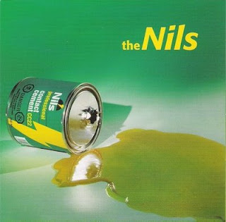
This album is in fact a compilation album from the Canadian punk and pop band The Nils. The Montreal band lasted from 1978 until 1994. The band started at a young age by Alex Soria and his brother Carlos. The compilation features more than 20 tracks collecting early demos, recordings, songs from the bands EP's and full length album. The artwork on the albums cover is a spilled over can of contact cement. Shades of green dress the albums cover.
The Professionals - I Didn't See It Coming (1981)
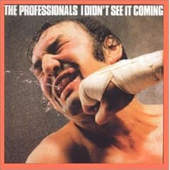
Formed by Steve Jones and Paul Cook (of Sex Pistols), The Professionals released I Didn't See It Coming in 1981. The album was actually a re-recorded version of the bands first album which was never released (it was eventually released in 1990 and in 1997). The cover is pretty simple, a guy getting punched in the face. An effective and eye catching album cover.
The Damned - Don't Cry Wolf (Single 1977)

Don't Cry Wolf was a single taken from the bands second album Music For Pleasure. This album would be The Damned's last with guitarist Brian James, it was also produced by Nick Mason (of Pink Floyd). The B-side to Don't Cry Wolf is the song "One Way Love". The B-side (which is also on Music For Pleasure) has some almost country like guitar licks on it. The song is an excellent example of the guitar work of Brian James. The single artwork features what looks like scalpels in a star shaped pattern surrounding the bands name and the songs title.
The D4 - 6Twenty (2001)

The 2001 album from New Zealand Garage Rockers, The D4 was named after a guitar amplifier. The cover features the band members silhouetted in black and red, while guitarist Dion Palmer aims his guitar in a gun-like fashion. The album itself is great representation of high energy Rock and Roll. The album had six singles released, none of which charted in the US. Some singles from the album did make it on to the UK singles charts.
Queens of the Stone Age - Era Vulgaris (2007)

The artwork for Era Vulgaris features two light bulb characters, one which is a green light bulb that has an eye patch (known as "Patchy") and Bulby a yellow bulb smoking a cigarette. The light bulb cartoons were created by Liam Lynch and the overall art direction was done by Jason Nato & Doug Cunnigham of Morning Breath Inc. Josh Homme has stated in an interview that light bulb represents an idea that you think is really great, but in reality it is not. Era Vulgaris was the fifth album by Queens of the Stone Age.
Sloan - Navy Blues (1998)

Sloan's follow up to 1996's One Chord To Another was Navy Blues. The album featured songs such as "She Says What She Means" and "Money City Maniacs". Navy Blues combined elements of the bands 60s Pop/Beatles style with 70s Hard Rock. The albums artwork features a picture of each band member separated by lines that are similar to work done by Saul Bass (American graphic designer and film maker). For an animated, filmic extension of the album cover check out the video for "Money City Maniacs".
Neil Young - On The Beach (1974)

This was an album that has interesting things to pick out on the cover. There is part of what looks like a Cadillac buried in the sand, a patio table and chairs, a person out in the distance and a hanger hanging under the umbrella (there are more things too if you look closely). This album was originally released in 1974 and for a long time it was out of print on vinyl and it not available on CD. In 2003 it was finally released on CD.
Joe Strummer & The Mescaleros - Streetcore (2003)

The artwork to the third album by Joe Strummer & The Mescaleros is credited to Art Dog and Joe Strummer. The album which was released posthumously showed the Mescaleros returning to a more Rock/Clash like form. Streetcore featured songs such as "Coma Girl", "Get Down Moses", "Long Shadow" and "All In A Day", all of which display differing musical styles while still staying true to the edge of Rock and Roll. The cover displays a coil that looks like it is dripping, five black stars placed in two different locations on a bright orange background.
The Strokes - Room On Fire (2003)
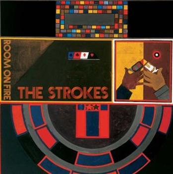
The Strokes second album was panned by critics when it was originally released. The albums cover features what looks like a black jack card table (or some sort of card table that would be used in a casino), two hands of opposing colours firing at each other and the bands album title. The album musically was influenced by New Wave music such as Talking Heads, The Cars and the bands previous Garage Rock influences.
The Kinks - Kink Kontroversy (1965)

Originally released in 1965, Kink Kontroversy mixed early Kinks Garage Rock style with Blues. The albums cover features five squares. The main square features a close up Dave Davies playing guitar. Atop of it there are four squares each of which has a different Kinks band member inside. The albums title is a play on the bands onstage antics, and fighting which led to them being banned in the US.
The Hives - Walk Idiot Walk (Single 2004)
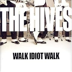
The single to the Hives song "Walk Idiot Walk" featured two B-sides "Genepool Convulsions" and "Keel Hauling Class of '89". The single is a song that comes from The Hives 2004 album Tyrannosaurus Hives. The single also contains the music video made for the song. The video features the band in a white room with a scrabble board that changes letters in the background. The cover is a shot of the band members holding their instruments on a white background, which is a similar style to the music video for the single.
Sex Pistols - Nevermind The Bollocks (1977)

The one and only album by Sex Pistols featured cut out ransom styled lettering. In the UK the letters were outlined in pink, while the background is yellow. For the US release the colours differ. The letters are outlined in green with a light pink background. The cover was designed by Jamie Reed and has since been copied by numerous punk bands. Without an album like this, who knows what rock music would sound like today?
Buzzcocks - Promises (Single 1978)
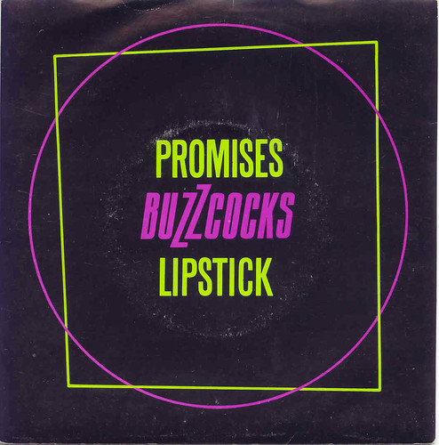
All of Buzzcocks early singles have interesting artwork designs. Promises is one of my favourites, it is designed in a pop art style and features a green square outlined by a purple circle on a black background. The song was recorded just after the release of the bands second album Love Bites and was originally titled Children. The song was also added to the Singles Going Steady compilation in 1979.
Wire - Chairs Missing (1978)

This album cover is simple, there are no chairs on the front cover and there is a table with purple flowers on top of it. There are also brownish grey curtains in the background. The covers concept was created by Graham Lewis and Colin Newman (of Wire), while the cover photo was taken by Annette Green and the overall art direction was created by Brian Palmer. The albums title is derived from a British slang for a person that is a little bit disturbed. For example, that man has some chairs missing from his front room. The album featured more pop oriented compositions than the bands previous effort Pink Flag.
The Clash - London Calling (1979)

The artwork is to 1979's London Calling is now seen as an iconic image. The cover is reminiscent of Elvis Presley's first album and they both employ a similar font style. Elvis's album features Elvis raising his guitar up while London Calling features Clash bassist Paul Simonon smashing his bass down to the floor. The photograph on the cover was taken during a Clash concert in New York by Pennie Smith. The graphic design was done by Ray Lowry. I enjoy almost all of The Clash's album covers and single artwork, some other interesting ones to check out are Radio Clash, Bank Robber, Magnificent Seven and of course their other album covers.
Other interesting artwork:
Elvis Costello & The Attractions - This Year's Model (1978)
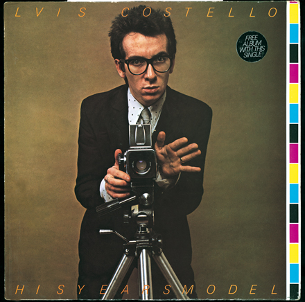
The artwork to this album cover was designed by Barney Bubbles. The concept is simple, Elvis Costello standing in front of a camera with his right hand sticking out, the background is a golden brown colour. The US version of this album did not have the songs "(I Don't Want To Go To) Chelsea" and "Night Rally", instead of those tracks the song "Radio, Radio" was added. A slightly different album cover was also used for the US version.
Talking Heads - Take Me To The River (US Single 1978)

Talking Heads were another band that had interesting album covers. The US version for the song Take Me To The River is one of my favourites. The song was actually a cover of a song that was originally by Al Green. The cover of the US single was of a gospel tabernacle and lttle wavy lines at the bottom for the water. The UK version was a variation of the cover for the album More Songs About Buildings and Food, which is also interesting. Other great covers by Talking Heads include the Fear of Music album cover, and covers for the singles Crosseyed and Painless, Road To Nowhere, Life During Wartime and Psycho Killer.
Rolling Stones - Let It Bleed (1969)
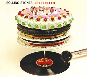
Let It Bleed was a follow up to 1968's Beggar's Banquet. There are so many things that can be picked out on the cover. The cover displays a picture of a record player and spindle, on top of the spindle there is a variety of things stacked up. There is a stack of records, a reel to reel tape, a tire, a pizza and a cake. On top of the cake there are little figures of each band member.
The Beatles - A Hard Day's Night (1964)

You cannot discuss artwork by rock bands without bringing up The Beatles. While they have many covers which are seen as innovative, There are two in particular that have always been interesting to me. First, The UK version of A Hard Day's Night which was the soundtrack to the film of the same name. The US version featured a different track listing. The UK cover features photos of every Beatle member in different poses. The US version featured four large photos of each Beatle, from the nose up. This was also the very first full length album by The Beatles that had all original compositions on it.
The Beatles - The White Album (1968)
 My second choice for Beatles artwok is one of my favourite albums ever, The White Album. The artwork is also quite simple and inventive. Designed by Richard Hamilton the cover was white, with the bands named lightly showing on the cover. While the album was originally going to be called A Doll's House, the band decided on just calling it "The Beatles", but because of the artwork it is usually referred to as The White Album. Since it's release numerous bands have had self titled albums with a plain colour for its cover.
The Play List:
1. Dead 60s - Riot Radio
2. XTC - Meccanic Dancing (Oh We Go)
3. U2 - 11 O'Clock Tick Tock
4. Devo - Be Stiff
5. The Cure - 10:15 Saturday Night
6. Franz Ferdinand - You Could Have It So Much Better
7. The Diodes - Polaroid
8. The Nils - Freedom
9. The Professionals - Madhouse
10. The Damned - Don't Cry Wolf
11. The D4 - Come On!
12. Queens of The Stone Age - Make It Wit Chu
13. Sloan - Stand By Me, Yeah
14. Neil Young - Walk On
15. Joe Strummer & The Mescaleros - Coma Girl
16. The Strokes - I Can't Win
17. The Kinks - The World Keeps Going Round
18. The Hives - Genepool Convulsions
19. Sex Pistols - Pretty Vacant
20. Buzzcocks - Promises
21. Wire - Outdoor Miner (Single Version)
22. The Clash - Rudie Can't Fail
To download this week's show visit the CJAM archives and select the files 10:00 AM and 11:00 AM on July, 21st 2009.
5 comments:
Hi there. The Diodes Action Reaction will be available as a physical cd in late Sept.
The digital version is on itunes now.
Thanks
Ralph Alfonso
Bongo Beat Records
http://www.bongobeat.com
Thanks Ralph,
I made the correction. I'm looking forward to the CD re-issue.
Hi Dave, your show is really good. Greatest music ever made... congratulations!
I've added your blog on my bloglist, as I'm a blogger too. Check this: http://factor-zero.blogspot.com
Thank you!
the back of the hard days night US release actually features the front of the UK release.. still an orange lay out.. but all the pictures from the UK release were still used.
Interesting. I did not know that.
Post a Comment